

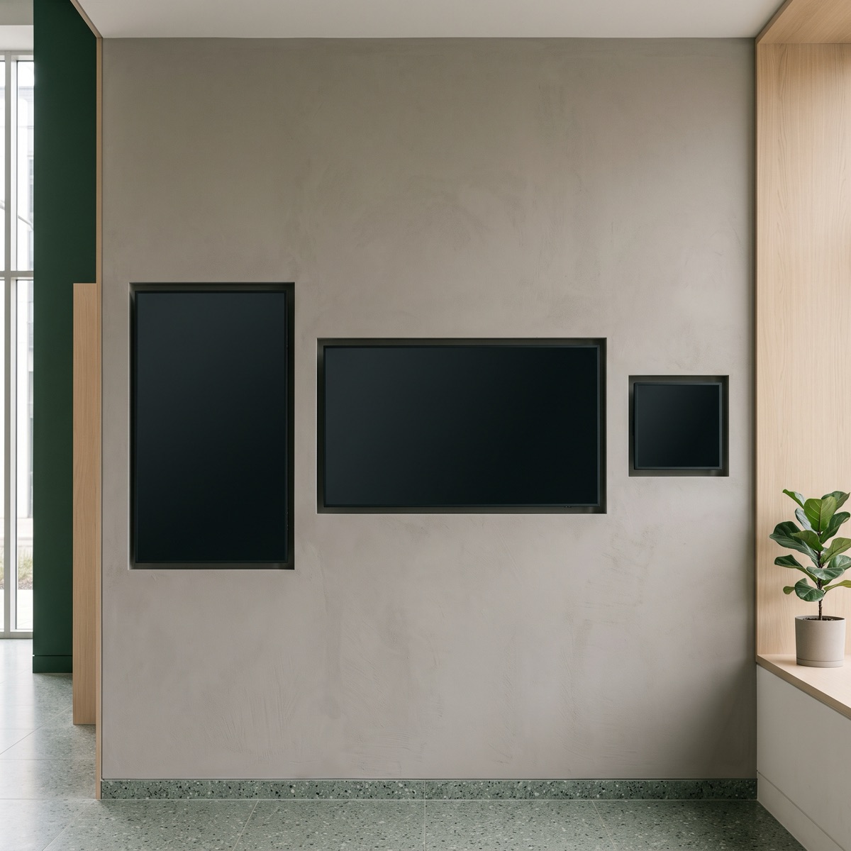
Most digital signage software solves for one screen shape and treats everything else as a resize. That works until the estate contains a 4.2 inch portrait e-paper tag and a 16:9 lobby display, at which point resizing produces something technically rendered and practically unreadable.
The reason is that scaling preserves proportions, and proportions are not what makes a layout work. What makes it work is a hierarchy: which element must survive, which can shrink, and which should disappear entirely.
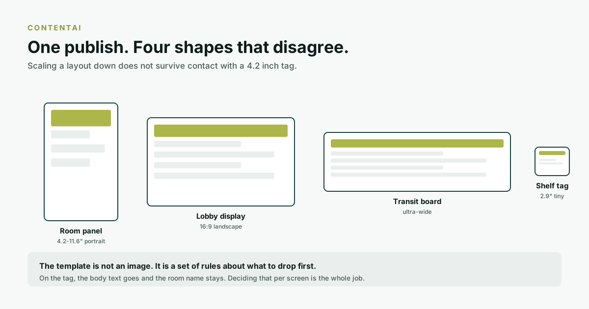
The four shapes, and why they fight
| Surface | Shape | The constraint |
|---|---|---|
| Room panel | Portrait, 4.2" to 11.6" | Read at arm's length, in a corridor, in about two seconds. |
| Lobby display | 16:9 landscape | Read at six metres, by someone walking. |
| Transit or wayfinding board | Ultra-wide | Many rows, scanned rather than read. |
| Shelf or bed tag | Tiny, often 2.9" | One fact, and it had better be the right one. |
A layout that works at six metres has three words on it. A layout that works at arm's length can carry a sentence. Putting the six-metre layout on the tag gives you three enormous words; putting the arm's-length layout on the lobby screen gives you a paragraph nobody will stop to read.
A template is a set of rules, not a picture
The workable model is to define, per template, an order of importance and a set of drop rules. Not "this text is 18px" but "this is the primary field; keep it. This is secondary; shrink it, then drop it below this width."
For a room panel that ordering is usually:
- Room name. Never drops. If only one thing renders, it is this.
- Status: free, in use, starting soon. Colour and word, because colour alone fails on a limited palette and for colour-blind readers.
- Time boundary. "Free until 14:00" is the second most useful fact in the corridor.
- Meeting title. Drops first, and on many sites should never render at all. A meeting title on a door is a small confidentiality leak that nobody signed off.
- Organiser, capacity, amenities. Nice on an 11.6 inch panel, gone on a 4.2 inch one.
The constraints that are not about size
Refresh speed
An e-paper panel takes about a second to redraw and flashes while it does. That rules out anything that changes frequently. A countdown ticking every second is both impossible and, if attempted, a battery problem. The same content on an LCD can update continuously. One template, two behaviours.
Colour
E-paper offers a palette rather than a gamut. A status colour has to be chosen from what the panel can actually produce, and has to remain distinguishable in the corridor's lighting. This is why status is always a word as well as a colour.
Viewing distance and light
E-paper is reflective, so it gets more readable as a corridor gets brighter. An LCD gets less readable. A template deployed to both cannot assume either.
What ContentAI does about it
ContentAI is the content layer across every ElhiTech surface. The parts that bear directly on the problem above:
- Templates defined per surface type rather than one master artwork stretched across the estate.
- Smart Content, which selects what to show based on context rather than requiring a separate schedule per screen.
- Client URLs, for pulling a live source into a template rather than republishing it by hand.
- Events and scheduling, so a lobby screen can carry a different message during a conference without a separate estate.
- Media player and device control, because a screen that has silently stopped updating is the failure mode all signage shares.
The last one is worth dwelling on. Every display technology fails the same way: by continuing to show the last thing it successfully rendered. Whatever you buy, the question to ask is how you find out that a screen has stopped, because you will not find out by looking at it.
If you are specifying this
- List your surfaces by shape and viewing distance, not by product name. Two 16:9 screens at 1m and 8m are different surfaces.
- Write the drop order for your primary template before anyone opens a design tool.
- Decide the meeting-title question explicitly. Whether meeting titles appear on door panels is a confidentiality decision, not a design one, and it should be made by someone empowered to make it.
- Test the smallest surface first. If the content works on the tag, it will work everywhere; the reverse is never true.
- Ask how you are alerted when a screen stops updating, and check that alert lands somewhere a person actually reads.
The underlying point
An estate with one CMS and many screen types is not trying to make one design fit everywhere. It is trying to make one decision. What matters most on this screen. Travel everywhere, and let each surface express it in the way its physics allows. That is why the answer is a rules system rather than a bigger set of artwork files.
Frequently asked questions
Can one digital signage template work across different screen sizes?
Only if it is defined as a set of rules rather than a fixed layout. The template needs an order of importance and drop rules, which element must always render, which shrinks, and which disappears below a given size, because scaling a layout down preserves proportions and loses legibility.
What should always appear on a meeting room door panel?
The room name, always. Then status as both a colour and a word, then the time boundary such as free until 14:00. Meeting titles should drop first and on many sites should not render at all, since a meeting title on a door is a confidentiality decision.
Why do e-paper and LCD screens need different template behaviour?
E-paper redraws in about a second with a visible flash, so frequently changing elements are impractical and costly in battery terms. It also offers a limited colour palette rather than a full gamut, and gets more readable in bright light where an LCD washes out.
Should meeting titles be shown on room panels?
That is a confidentiality decision rather than a design one. A meeting title visible in a corridor discloses something about who is meeting whom. It should be decided explicitly by someone empowered to make that call, and configured accordingly.
How do I know when a display has stopped updating?
You will not know by looking at it. Every display technology fails by continuing to show the last thing it successfully rendered. Device monitoring that raises an alert somewhere a person actually reads is the only reliable answer, and it is worth confirming before purchase.
Which screen should I design for first?
The smallest. Content that works on a 2.9 inch tag will work on a lobby display; content designed for the lobby display almost never survives the reduction, because nobody decided in advance which elements were expendable.